Newton's Prism Changed Everything: How 350-Year-Old Color Science Still Shapes the Way Artists Work Today
Newton's Prism Changed Everything: How 350-Year-Old Color Science Still Shapes the Way Artists Work Today
Picture Isaac Newton in 1666, holding a glass prism up to a beam of sunlight and watching white light shatter into a ribbon of color across the wall. He wasn't trying to help painters. He was doing physics. But what he accidentally handed the art world was one of the most powerful creative tools in existence — a systematic understanding of how color actually works.
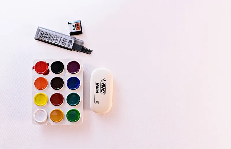
Fast forward 350-something years. You're staring at a color wheel in Procreate, or squeezing cadmium red and ultramarine blue onto a palette, or trying to figure out why your painting feels weirdly flat even though you used a dozen different hues. The answer to that last problem? Newton probably figured it out before your great-great-great-grandparents were born.
Let's break down the big ideas — and more importantly, let's make them actually useful.
The Color Wheel Wasn't Always Obvious
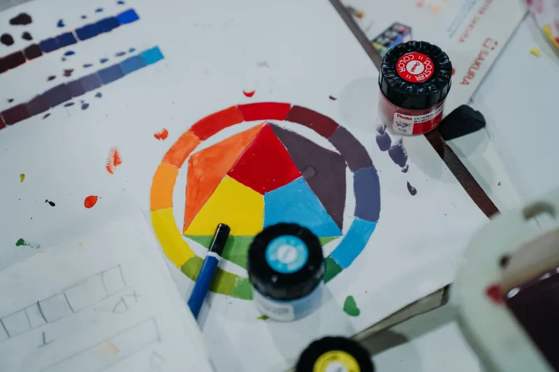
Newton was the first person to bend the visible spectrum into a circle, connecting red back to violet and creating the original color wheel. It sounds simple now, but that single move — closing the loop — gave artists a map. It showed relationships. It made patterns visible.
About a century later, painter and theorist Johann Wolfgang von Goethe pushed back on Newton's purely scientific approach and argued that color is also a psychological experience. He was right, and that tension between the objective and the felt is still at the heart of how artists think about color today.
Then came Michel Eugène Chevreul in the 1830s, a French chemist working for a tapestry manufacturer who noticed that the colors in woven fabric looked different depending on what was next to them. He named this "simultaneous contrast," and it quietly revolutionized painting.
What Simultaneous Contrast Actually Means for Your Work
Here's the short version: colors change each other. A gray square looks warmer when it's surrounded by cool blue, and cooler when it's surrounded by warm orange. The same gray. Two completely different experiences.
This is why painting "what you see" is trickier than it sounds. Your eye is constantly being influenced by context. The shadow on a yellow apple isn't just dark yellow — it's pulling toward violet because your brain is compensating for the yellow's intensity.
Try this right now: Grab two identical swatches of a neutral gray (you can do this digitally or with paint). Place one on a sheet of bright orange paper and the other on a sheet of deep blue. Look at them side by side. The gray on the orange will read as cooler and slightly bluish. The gray on the blue will read as warmer. Same color, totally different vibe. That's simultaneous contrast in action.
Once you see it, you can't unsee it — and more importantly, you can use it deliberately.
Complementary Colors: More Than Just "Opposites"
Every intro art class covers complementary colors — red and green, blue and orange, yellow and violet. They sit across from each other on the color wheel. Cool. But the real magic is in why they work together so powerfully.
When you place complements next to each other, they vibrate. Each one makes the other look more intense. The Impressionists — Monet, Pissarro, Renoir — weaponized this. Look closely at a Monet water lily painting and you'll find strokes of orange in the shadows of a blue reflection. It shouldn't work on paper, but in practice it creates a luminosity that no single color could achieve alone.
The Post-Impressionists went even further. Georges Seurat built entire paintings out of tiny dots of complementary colors, letting your eye mix them optically rather than blending them on the palette. He called it Pointillism. Scientists called it divisionism. Either way, it was 350-year-old color theory taken to its logical extreme.
Try this: Pick a subject — a piece of fruit, a houseplant, a mug on your desk. Paint or sketch it using only one color and its complement. No neutrals, no black, no white. Just those two colors in varying mixtures and proportions. You'll be amazed how full and alive the result feels.
Color Temperature Is the Secret Language of Depth
Warm colors (reds, oranges, yellows) tend to advance — they feel like they're coming toward you. Cool colors (blues, greens, violets) tend to recede. Landscape painters have been using this for centuries to create the illusion of atmospheric depth, making distant mountains feel miles away just by cooling and dulling the color.
But here's where it gets nuanced: warm and cool are relative. Cadmium yellow is warm. Lemon yellow is cool. Ultramarine blue is warm (it leans red). Cerulean is cool (it leans green). Understanding these subtle temperature shifts within a single hue family is what separates flat-looking paintings from ones that feel like they have air in them.
Try this: Mix three versions of the same color — one leaning warm, one leaning cool, one neutral. Paint a simple form (a sphere or a cube works great) using those three versions to define light, shadow, and midtone. Watch how much more dimensional it looks compared to using the same color straight from the tube.
From Oil Paint to Hex Codes: The Theory Doesn't Change
One of the coolest things about color theory is that it doesn't care what medium you're using. Whether you're working in watercolor, acrylics, gouache, or a digital program like Adobe Illustrator or Affinity Designer, the relationships between colors behave the same way.
Digital artists actually have an advantage here — tools like the color wheel in Procreate or the color harmonies panel in Adobe Color let you visualize complementary, triadic, and analogous relationships instantly. But understanding why those harmonies work makes you a much more intentional user of those tools, rather than just spinning the wheel and hoping something clicks.
Graphic designers, illustrators, and UI designers all rely on color theory daily, often without realizing they're drawing from a tradition that predates the United States itself.
The Oldest Tools Are Often the Sharpest
There's something genuinely exciting about the fact that a scientist fiddling with a glass prism in 17th-century England gave us a framework that's still completely relevant in 2025. Color theory isn't a dusty relic — it's a living system that keeps proving its value across centuries, media, and styles.
If you've been treating color intuitively and hoping for the best, consider this your invitation to go a little deeper. You don't need to memorize textbooks. You just need to start noticing — the way a shadow shifts toward blue on a warm afternoon, the way two colors seem to hum when placed side by side, the way a painting pulls you in from across the room.
That pull? Newton saw it coming.